|
Article by Michael Pinto
Here they are — the good, the rad and the unusal — the best manga and anime themed book covers that I've come across in the past month or so. In each case I've noted what I like about the artwork, and why it caught my eye. If you would like to see any of these cover up close, just click on the illustration for a larger sized image.
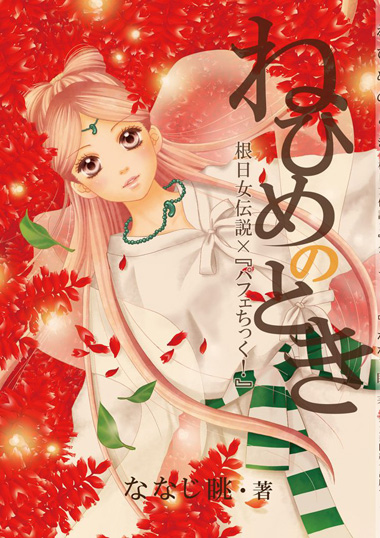
ねひめのとき―根日女伝説×『パフェちっく!』
I love the bold use of color in this illustration (not to mention that to an American eye that it's hard to combine red and green and not make something feel like Christmas). Source.
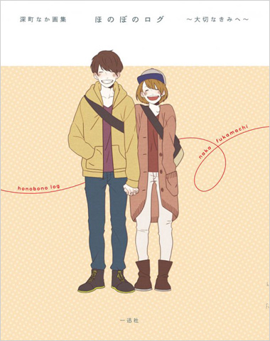
深町なか画集 ほのぼのログ ~大切なきみへ~
The composition of this cover really communicates the idea of a slightly awkward first romance. I love the use of negative space which makes the two characters really pop out from the background. There is also a nice sophisticated toned down use of earth colors which you don't often see with in the romance genre. Source.
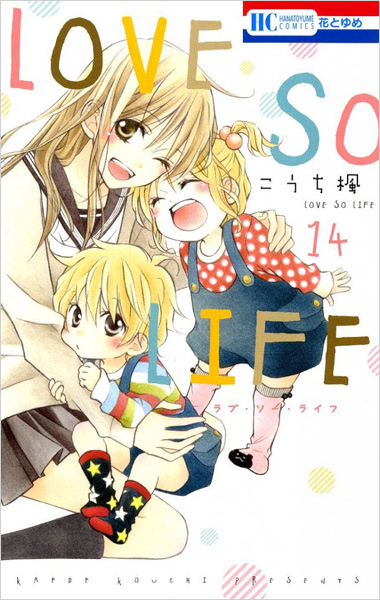
こうち楓「LOVE SO LIFE(14)」
This illustration is all about the kawaii! I love the sketchy look of the drawing and the two very contrasted expressions in the faces of the two children (screaming and shyness). Source.
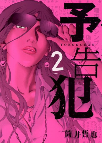
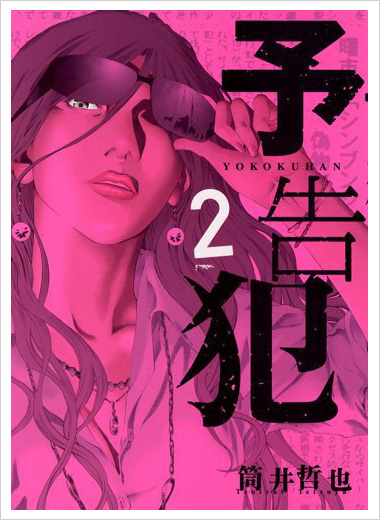
筒井哲也「予告犯(2)」
This illustration is all about the bold use of color — and magenta and purple make a strong moody combination. Source.
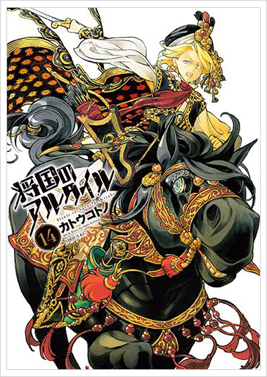
カトウコトノ「将国のアルタイル(14)」
The level of detail in this drawing is just amazing, and then you add the fact that drawing a horse in a forced perspective — which is a difficult task to tackle for any artist. And yet with all of that craftsmanship a great deal of character really comes out in the face of the horse and the young lady who is trying to go for ride. Source.
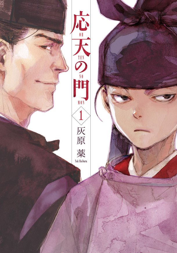
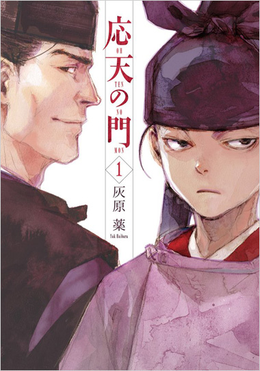
灰原薬「応天の門(1)」
It's so rare that in this age of Photoshop that you see a well done watercolor illustration used on an American comic book — which is why I love this manga cover. And I love the fact that you can really see the texture of the painting. Source.
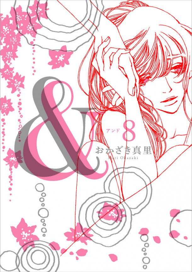
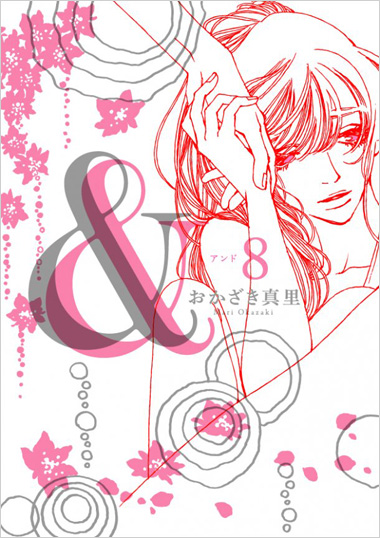
おかざき真里「&―アンド―(8)」
What I love about this cover is that it's very abstract, and the composition forces you to really look at the lines. And as a designer I love the color combination of pink, gray and red. Source.
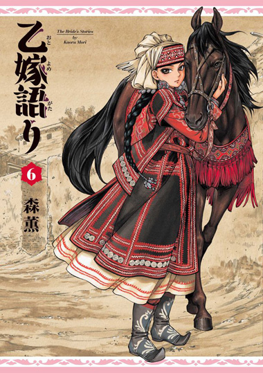
森薫「乙嫁語り(6)」
This illustration feels like a traditional Chinese painting, yet it has a very cartoony feel to the character design. And I really love the level of detail on her costume. There are so many nice little touches, be it the braids in her hair ir the artwork on her boots. Source.
|
|
|
 |
|
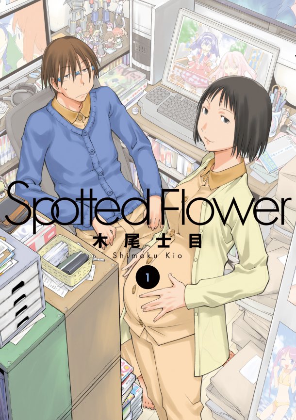
木尾士目「Spotted Flower(1)」
Can you even imagine a cover like this appearing on an American comic book? I love the contrast of the geeky guy surrounded by technology and young lady who is clearly expecting at any moment. And then all of that is a wonderful contrast to the typical kawaii anime art shown surrounding them.
Source.

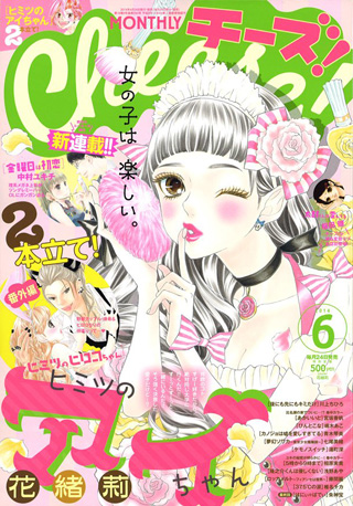
Cheese!6月号
Pink and green can be cheesy, but I like that.
Source.
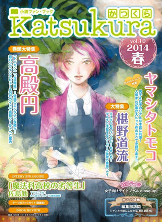
かつくらVol.10 2014春
This cover is a bit busy with the typography, but I love the illustration which uses watercolors
in a very bold way. Source.
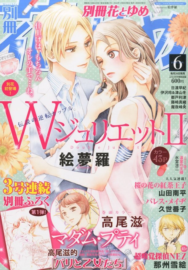
別冊花とゆめ6月号
The use of muted colors here brings me back to the 80s in a good way.
Source.

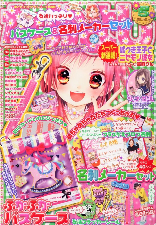
なかよし5月号。表紙イラストは美麻りんが執筆した。
This dense cover art is all about the pink, the pink, the pink and sparkly magic — what's not to love?
Source.

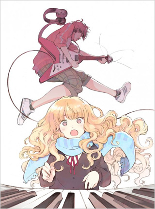
「フジキュー!!!」キービジュアル
The composition of this drawing is very powerful with its forced perspective. Rock on!
Source.
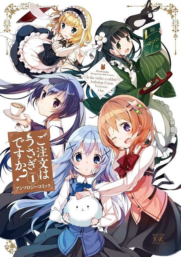
アンソロジー「ご注文はうさぎですか? アンソロジーコミック(1)」
This is a typical art book cover, but I love how the artist has all five characters working so well together (well six if you count the cat). Source.

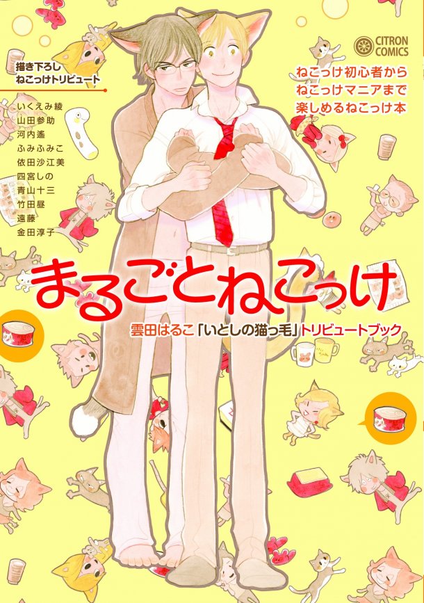
まるごとねこっけ
Meow, meow, meow! My favorite thing about this illustration are the countless cute illustrations floating around in the background of the cover.
Source.

|
|
|